Monday, January 27, 2014

Things on the Brain Lately

I've got a completely random assortment for you today.  Sometimes that's just how it rolls around here.  I get something on my brain, and I can't stop thinking about it.  In no particular order . . . 

Wouldn't this be a fun gift for someone who is into photography (and coffee)? 

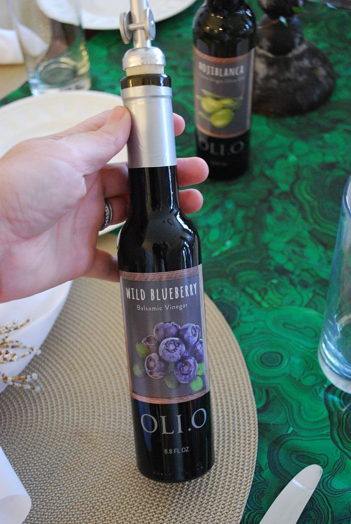
I've been obsessing over table settings with combinations of blues and oranges - from watery turquoise and pumpkin orange. . . 

to navy with a sherbet melon like color.  These colors always seem to work well together.

I discovered this product before the holidays and just adore it.  In fact, when I get home in the evenings I immediately start thinking about getting to wash my face with it - long before bedtime!  My skin has been super dry this season and this stuff has lots of moisture.  It also removes my eye makeup all in one step.  It has a wonderful girly smell, but not too strong.  I think that's what I most look forward to at the end of the day - the wonderful smell.  I can tell my skin feels softer and smoother - no more dryness.   While it may seem expensive, you only have to use a tiny amount.  It has these micro beads in it that foam like crazy. So, a little goes a long way.

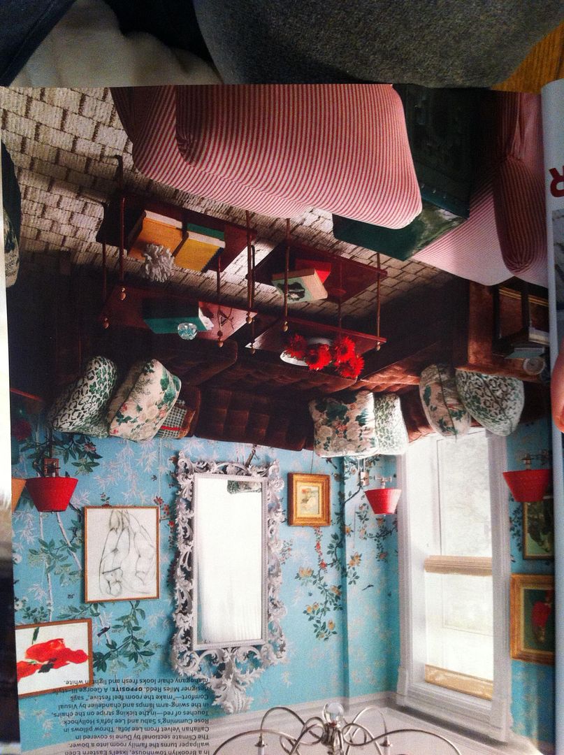
I'm working on a couple of spaces where we are trying to achieve the perfect soft turquoise color.  I sort of feel like soft turquoise is an oxymoron, since turquoise is anything but soft.   Short of yellow, I think this color is one of the most difficult to get right.  You see, turquoise is a great combination of green and blue.  Then when you start to water is down to a soft hue, the color seems to read either blue or green.  I thought we had it at one point but then realized it looked like a blue in a boy's nursery - NOT what we were going for in the least.  So, I'm beginning to think I need to create a custom color.  Here are a few we tried that are lovely colors but just don't seem to work given our lighting in the two different rooms. 

Ben Moore Quiet Moments 

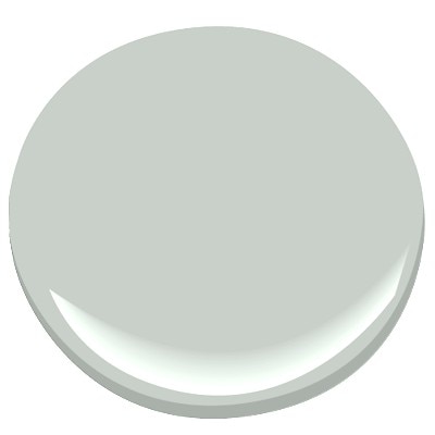
Sherwin Williams Copen Blue

Sherwin Williams Sea Salt

Behr Lime Light 

Behr Reflecting Pool

So, I would love to hear from you on any that you think are tried and true and continue to maintain the perfect blend of blue and green in a light intensity!

Got this candle from a close friend for Christmas, and it's already gone.  The autumn undertones mixed with a smokey thing (I can't tell if it's an outdoor fire pit/smores smell or something more like a man's pipe smoke, but it's a sweet wintery aroma.)  Must. Have. More. Of. It.  

I just discovered Stitch Fix.  

Not sure where I've been, but I'm now on board and super excited about this clever company.  Have you heard of this?  You go online and fill out a very detailed survey of your likes and dislikes along with your measurements.  Then a stylist pulls items specifically for you and sends you a "fix" of items you might like.  You try it on and only keep what works.  You can decide how often you would like the "fix" and the stylist select things accordingly.  I've not received my first box, but I have to confession, it's pure curiosity that is driving me here.  I'm dying to know what someone else would pull for me to wear.   I'll keep you informed - no selfies on this one, I promise!

So, that's it for now.  I've got a couple of redesigns this week.  So, posting will be sporadic.  My goal is to be better about photographing my projects.  I get so into the project, I completely forget to photograph it.  Happy Monday! M.


Friday, January 24, 2014

Happy Weekend - What?! Tidbit

Sorry for the MIA this week.  I've been playing catch up on design projects.  Just had to check in with you on a very cold Friday morning with this interesting tidbit.

Have you seen the uniforms for the 2014 Winter Olympics?!  Really.   Was totally shocked by RL's design this year, especially after the completely gorgeous commercial airing just before every episode of Downton Abbey? Talk about a complete 360. . . 

Looks like the athlete's will have the perfect outfit for next year's tacky sweater party!  Happy weekend. M.


Tuesday, January 21, 2014

Weekend Entertaining

Sorry my post is a bit late this week, we were enjoying the long weekend with no school yesterday.  It was great, but it makes for a short week with trying to squeeze five days of work into four!  Since Christmas, I've been doing a bit of cleaning and freshening up.  Every year, when the Christmas decorations come down, the house always seems a bit drab.   I think greenery adds so much to a space; and when it goes away, I really miss it.  Also, the bleak winter blues tend to set in with one cold wet day after another.  So, to combat all this, I decided to put together a simple Sunday lunch for some friends.  I love entertaining at home and a gathering gives me something fun to look forward to during the week.  Nothing like inviting friends over to force you to freshen up your house.

For my entry way, I decided to layer a silver tray with a white fluted container full of cyclamen which are in season right now.

I've never had luck with keeping these alive, but I enjoy them for a month or two this time of year.  Which leads me to another point, there is no reason to nurse a half dead house plant for nine months hoping it will look good again.

I'm giving you permission to toss that dead plant and  get something fresh that will make you smile when you come home.  This is one of the least expensive ways to freshen up your spaces!


So for my lunch, I decided to keep the menu simple.  The food does not have to be fancy, just good.  So, focus on recipes that will accomplish this when thinking about a lunch party.

Main Course
Chicken Chili
Lettuce Wedges with Pancetta 
Corn Muffins 

Dessert
Rustic Honey Crisp Apple Tart with Vanilla Ice Cream


 I served the chili in mugs rather than a bowl.  This is a great trick I learned from one of my favorite Stylist on the planet, Missie Crawford.

When you use a mug for soup,  there's plenty of room on your plate for side items and it also keeps the lunch feeling casual and relaxed.  I made a chicken chili, and it was delicious and easy (cooked it the day before in the slow cooker and just reheated it while we were at church).  Then, I gathered some fun toppings - shredded cheese, fresh avocado, sour cream and blue corn chips.  This gives your guests the ability to make the soup their own, and it's fun to see who likes "the works."

For my side salad, I really wanted something to contrast the chili.  So, I decided to go with a basic wedge salad with blue cheese dressing.  I used this recipe for the blue cheese dressing.  Then, to give the salad even more interest, I stopped by one of my new favorite shops in Mountain Brook village called Oli.O.  This is a olive oil and balsamic vinegar specialty store, and it's owned by Hutton Fant.

I finally got to meet Hutton and asked her for some help pairing the perfect oil and vinegar with my salad.  She came up with a wonderful combination to really make my salad unique.  Olive oils are very similar to wines in that they have lots of complex flavors and dimensions.   Selecting the perfect pairing with other foods is a true art, and Hutton knows her stuff!    For my salad, she suggested a drizzle of HojiBlanca olive oil and a Wild Blueberry infused balsamic vinegar over the entire salad as a finish.  The combination with the blue cheese dressing was wonderful!

You really have to experience this store.  They offer bits of bread, and you can taste everything.  Also, Hutton mentioned they are open to hosting tasting parties for small groups paired with wines.  Talk about a fun supper club outing!  For more information you can contact Hutton by clicking here.

For dessert, I made this apple tart -  a recipe from one of the best cooks I've ever met.  

Years ago, I watched her pull it together with simple ingredients from her pantry and frig, and never forgot it!  It's always a hit.  I made these the day before and heated them during out lunch and served them with Blue Bell Homemade Vanilla Ice Cream.

For my table setting, I decided to keep the agate runner in place (from the holidays) and added crisp pops white with my napkins and the orchids for a fresh feel.

Got the orchids on a recent trip to IKEA (their orchids are so inexpensive!).  I got some other fun items at IKEA which I plan to share with you in the next few months - very fun project.  Wait and see! 

I also added some angel vines which gives some height to the table.  I just love the containers.  These are actually hand made wine glasses from this cute shop called Patina's out of Mississippi.

They were a fun gift from my sister in law this year, and I love the casual feeling they add to the table as well.  If you decide to use pottery as a container for plants, be sure and place them in a plastic baggie to protect the porous surfaces.  

It was a super fun long weekend.  Now, time to get back into it!  Happy faux Monday! M.  

Friday, January 17, 2014

What's Trending for 2014

One of my favorite things about this time of year is thinking about what's trending for interiors in 2014.  This list comes from things I've been noticing more frequently on the web and also from other influences such as fashion, colors, and believe it or not, even technology.  All these elements have an impact on how we live and function in our spaces.  So here are trends I'm currently seeing which I predict will continue in 2014.  

Bright Painted Kitchen Cabinetry

This is a super fresh trend making a big splash.  Painted cabinetry has been around forever - but the color of the paint has changed dramatically over time.

First it was white, then the trend of painting the cabinetry the same as the wall color in soft beige tones (which I still love!), then the super white (for the entire kitchen).  Now, I am noticing the trend for rich pops of color for the cabinetry.

If you love this trend but are afraid to completely embrace it (since we know this can be an expensive trend), consider painting your kitchen island (or even a section of the cabinetry) a bright color for some pop.  


Mixing Metals
I'm seeing everything from gold and silver leafed, antiqued brass, wrought iron, copper and bronze finishes all living happily together.  The trick here  -  the more you mix it, the better it feels and works.

The easiest, least expensive way to experiment with this trend - select small accessories and picture frames.  You can find these in vintage shops, salvage outlets and even flea markets for an antiqued feel.  Also, it is perfectly acceptable for the finish not to be perfect - rust spots only add to the vintage feel here.

Midcentury Modern Influences
This trend really started with the introduction of Mad Men.  At first, it was super hip and only for the bravest of homeowners.   However, a couple of years later, lots of clients are jumping into this trend with lots of interiors seamlessly blending in the the vintage modern pieces with traditional elements for an amazing eclectic look.  

For a fun taste of this trend, consider including a pair of iconic Eiffel Tower arm chairs as host and hostess chairs either in your formal dining room or breakfast room area (if you want to keep it in a casual space).

More Organic Artwork
I absolutely love this trend of using non-art as artwork.  It makes interior design feel accessible to anyone brave enough to consider something outside the box. 

Gone are the days of waiting years to save up enough money for a piece from the most prominent artist you can afford. Instead, people are taking items that give color and interest and arranging them for a visual feast. 

When working with clients, I try to think about things that are meaningful - a hobby, their work, a treasured family piece.  I'm constantly thinking, "What can we hang on their walls?"  This is an easy one to incorporate into your own home, if you just sit and think about what you have that could be turned into artwork.

Navy as a Neutral
I have to confess, I was bummed when I learned Radiant Orchid was the color of the year for 2014.  I really wanted it to be some form of navy since I am seeing it so often these days for interiors.  

But, after some thought, I realized - navy is being used as a neutral in lots and lots of spaces.  So, to pick it as the color of the year would be like selecting Kaki as the color of the year.  With that in mind, I'm now thrilled it's not the color of the year.  So, we will be using it for years and years to come as a fresh take on neutrals.

Quartz Stone
Another trend I'm thrilled to see - Quartz.   If you are not familiar with this product, you have to go and see it in person.  With a price point (as well as the look/feel) comparable to granite or marble, quartz is being used in lots of kitchen and bath renovations.  The main reason?  It's performance is far superior to the others.  These days, clients seem to be more interested in making sure their interiors are practical and livable, rather than just pretty.  With Quartz, you can have both!

If you are a die hard granite fan, quartz may win you over.  There are lots of manufacturers of quartz, but some of it's attributes are a lifetime warranty, it's stain resistant (unlike marble), many can be polished or honed, and the slabs are consistent making the "grade" of the slab issue non-existent. 

If you are fan of marble, quartz can still work for you.  There are lots of colors that look like marble.  My favorite is by Ceasarstone, but Silestone has a couple of great colors as well.  No more fretting over a spilled glass of white wine or that spot of soy sauce that you forgot to clean up last night.    

Large Scale Floral Prints (in small doses)
As I mentioned two years ago, this trend is gaining steam.  With the release of Alessandra Branca's chintz collection for Schumacher this past year along with the use of these prints in small doses with modern fretwork patterns, I'm seeing lots and lots of large scale florals.  In fact, the current of House Beautiful has a feature on Miles Redd with an image of a Brooklyn Townhouse with accent pillows in  Lee Jofa's Hollyhock print.
image taken with iPhone from January 2014 issue of House Beautiful

It's a showstopper.  Just remember this is not your 1980's floral!  It's small does mixed with current trends to create something completely fresh.

So, those are predictions for 2014.  Let's see how they shake out!  Happy weekend, everybody. M.


Wednesday, January 15, 2014

Portfolio Update

If you recall, back in the Fall, I posted about one of my projects being featured in the Cottage Journal.  You can read all about it here.  Well, the editor graciously agreed to let me include a few of the images from the article on my website, and I'm just thrilled about it!  Here are a few more details on the space.

In the image below, we are looking into the kitchen from the family room.  Notice, the ceiling in the family room is vaulted, and my homeowner opted to leave the lower ceiling in the kitchen area. I think this was a great decision.  In addition to saving some real money on the construction, the lower ceiling in the kitchen area helps to give the entire space a cozier, more intimate feel.  Also, Twin Construction who completed the work, did a fabulous job marrying the ceilings in the two spaces.  

As for the furnishings, the homeowner had already ordered the rustic farm table and chairs for the family room when she contacted me to help her on this project.  So, my job was to create the perfect layout and select the other pieces for the space.  The home has a very traditional style, so blending this rustic feel with the traditional lines of the home was challenging.  

Since being published in the Cottage Journal, I have received at least a dozen inquiries from all over the country about the image below.  Everyone seems to love these barstools and have asked about my source.  

These are a semi-custom barstool.  I found the barstools on Overstock for a steal of a deal, but my client really wanted them to have a more comfortable feel for her guests to linger in the kitchen when she was cooking.  So, we selected a faux leather in a darker tone (to contrast all the lighter finishes in the new kitchen), and had my upholsterer add the upholstered seats.  The result - an affordable custom barstool.  Always try to "think outside the box" when selecting furnishings for your spaces.  The result will be an affordable custom look. 


Here's a close up of the island/sink area.  I just love the look of this apron front stainless steel sink.  It's a nice blend of styles - the apron front giving a farmhouse vibe with the stainless steel finish adding a more modern take.  

Since the farm table and chairs serve as the casual dining area for both the kitchen and family room, we opted to include this small seating area in the kitchen.  I love how the french doors behind open onto a deck with more seating.  Since we are in the South, this area can comfortably be used most months of the year.  I can just see these doors open for a late morning brunch in early Summer. 

Here is a close up of the glass front cabinets near the range.  If you have ample storage in your kitchen, it's nice to add these for display.  Also, I wanted to mention the countertops here.  Just before this renovation, my homeowner had purchased new appliances in black.  So, selecting a darker granite for the surround countertops (this is in absolute black) allowed the black appliances to feel like a purposeful selection, rather than an after thought.   Then to balance all the lighter tones of the space, the island is in a lighter granite with bits of darker tones.  Again to tie this kitchen together in a great way. 

Hope you enjoyed the tour!  If you are interested in seeing more images from the Cottage Journal, click here and subscribe.  Also, if you would like to see more of my portfolio, click here to check it out!  Happy Hump Day! M.


Monday, January 13, 2014

Out of Sight, Out of Mind

I've been thinking about this post for awhile.  I find there are lots of details in design which are super important to getting a high end look, yet most homeowners don't even realize they're significant.  The old saying "out of sight out of mind" definitely applies to the detail I want to talk about today - your rug pads.
via Veranda

  Many people don't bother to even use a rug pad (guilty on occasion) or they pick up the cheapest pad they can find and call it done.  While the proper rug pad is not necessarily the most expensive pad, the real trick is knowing which pad to use with your specific rug.  This depends on several considerations: the rug's material, the flooring you will be placing the rug; the wear/use the rug will receive (i.e., a high traffic area or kid's space), and the size of the rug.
via StyleBlueprint

Not only can the proper rug pad effect the appearance of the rug, it can also extend the life of a rug.  Thus, saving you thousands of dollars in the long run.  Rug pads generally fall into three categories: Foam (the most commonly used), felt or fiber, and rubber padding.  
via Architectural Digest

Take for example the rug near my front door.
via Interior Design Musings

This rug looks to be a Bokhara (although not entirely sure since the guls are square), and it's on hardwood floors.  While this area does not get a ton of traffic (most people come in through our breakfast room door), it's important the rug pad is thick enough to support this rug and prevent fraying.  Since traffic here was light, I had not invested in a rug pad (see preaching to the choir!).  But over Christmas, we had lots of gatherings, and I noticed people slipping on this rug.  So,  I just got this incredible new rug pad  from Rug Pad USA for this rug (as my helpful assistant demonstrates).

The pad is a thicker fiber with rubber matting on the back side to prevent slipping.  I love it!  I simply went to Rug Pad USA's website and found the one specific for my needs and they shipped it fast (almost as fast as Chinese takeout!)  No more slipping and my investment in this rug has a little insurance.

One thing I love about Rug Pad USA is this super helpful rug pad guide which gives you a handy chart including the floor type, rug type, size of the rug, and even if the pad is made in the USA.  One last thing to note, they even have a special pad for layering rugs over carpet which prevents bunching.  I love this layering trick to bring in more color, pattern and overall interest to a space.

Like the perfect dress, you need the proper foundation for it to look it's best!  Sometimes what finishes the room is not what you see, it's those details behind the Wizard's curtain.  Happy Monday. M.

Thanks to Rug Pad USA for sponsoring this post.