Tuesday, September 23, 2014

Creating More Space

Are you craving more living space and not sure how to get it?  Well, the basement is a great place to start.  If you've not thought about reclaiming that space, now's the time to consider it.  It's one of the cheapest ways to gain square footage since this space already exists in most homes.  You just have to make it livable.  

Here are some layouts I completed for a growing family who wanted more living spaces for their family.  When I develop furniture layout plans, I like to give my clients a couple of options on layouts so they can really think about how they want to live in the space.  

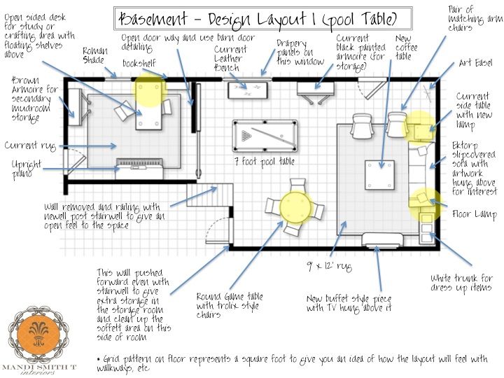
In the first layout, I included a pool table.  You need a proximately four feet of wall clearance for a comfortable game of pool (reminds me of an episode of Seinfeld when they put the pool table in a tiny bedroom).  So, in order to get this spacing, the client will need a seven foot pool table (as opposed to the standard eight foot table).  


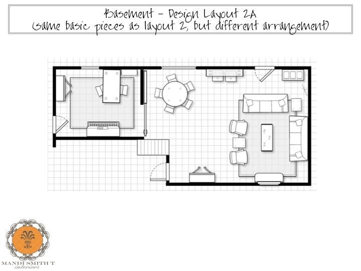
I also did a secondary layout that would maximize seating in the area - this is super important if the main function of this room is for watching football with friends!

Then, using the same basic furniture pieces, I created a different layout.  This is helpful for the client to see that they can make the space feel fresh an new by simply changing the layout of the pieces they already have for a new look. 

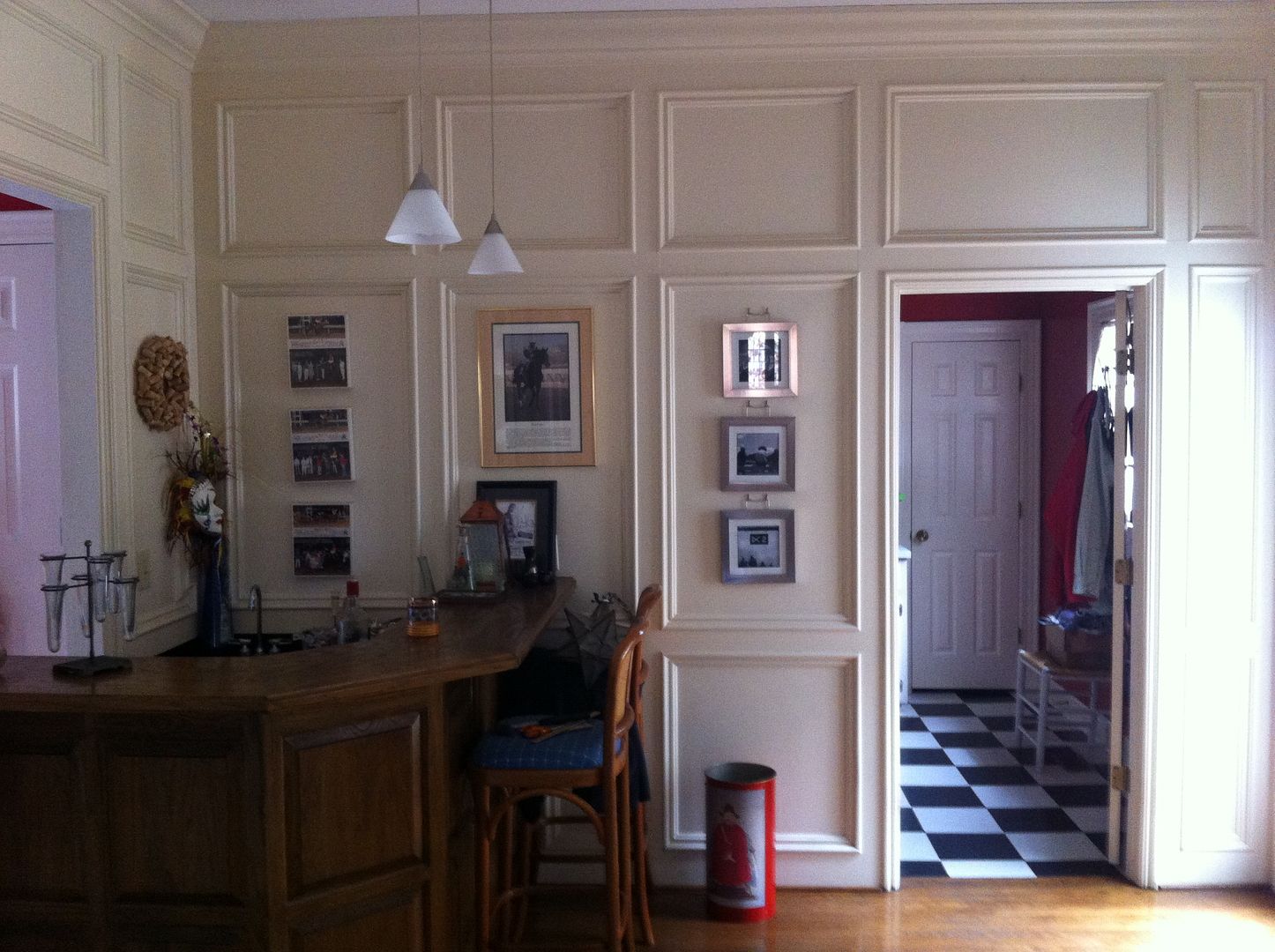
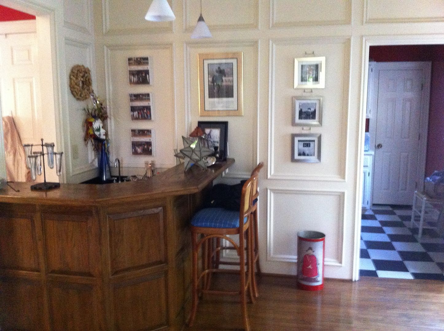
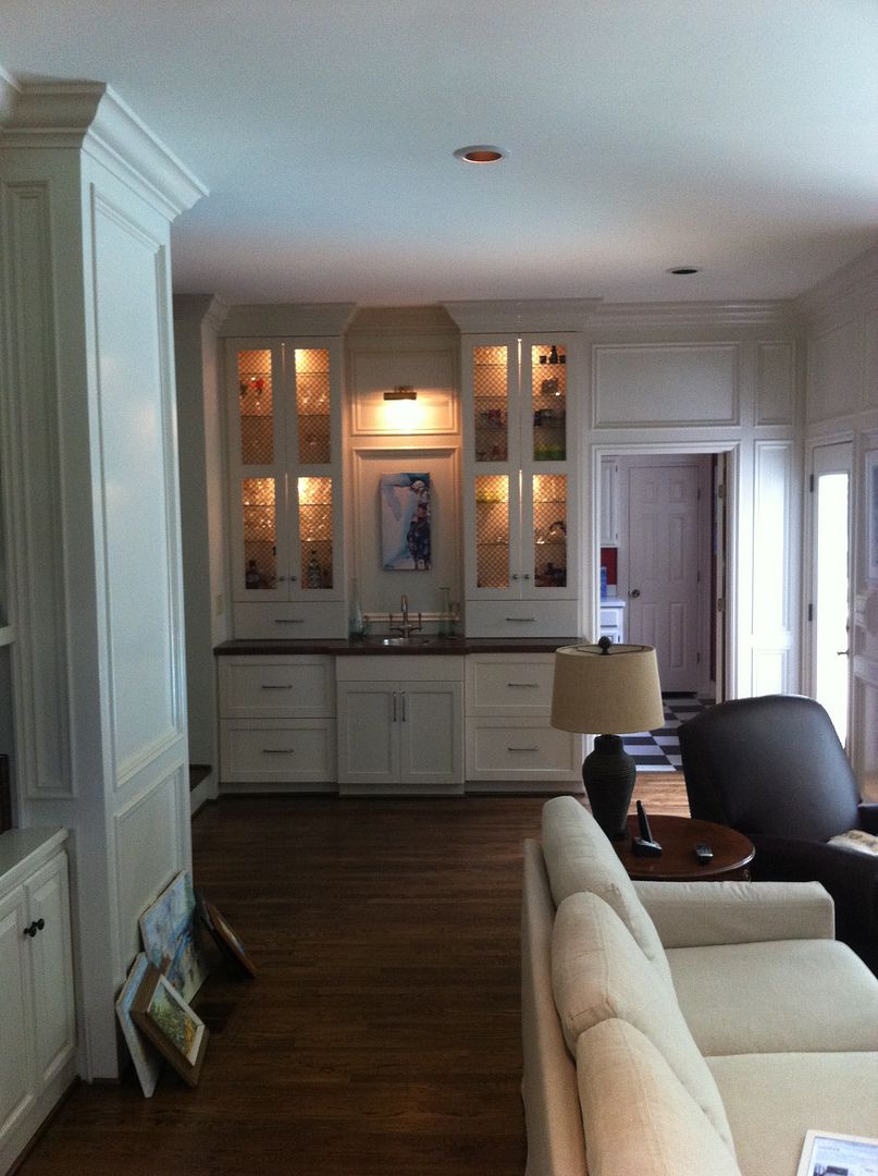
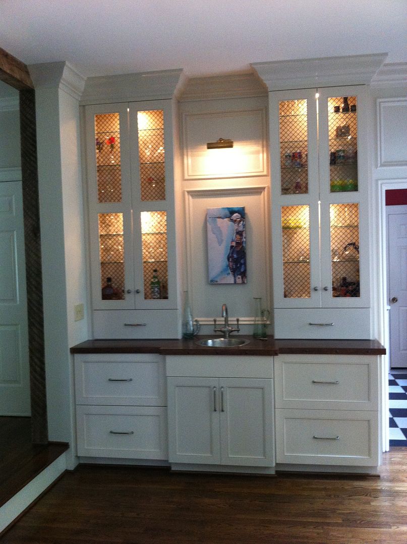
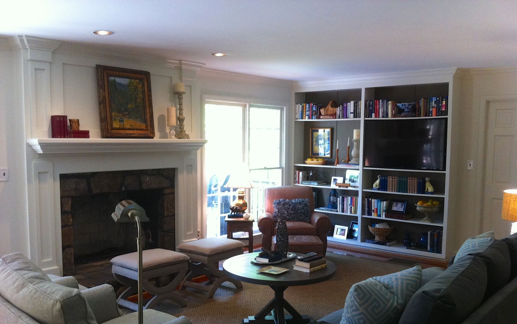
In addition to planning the perfect layout, there are a few other elements that can really change the way a basement area feels.  The single most important element would be lighting.  It's super important to make sure you have plenty of overhead lighting as well as layers of additional lighting in the form of floor lamps, table lamps, wall washers and /or sconces.  This will allow the space to feel light and airy as opposed to dark and cave like.  Here are a couple of other construction details that can really transform the feel of a basement area. 

If you have a soffit area than simply has to stay, consider creating an angled soffit (rather than a traditional boxed soffit).  It makes a huge difference visually to the space (especially if the ceilings are lower).

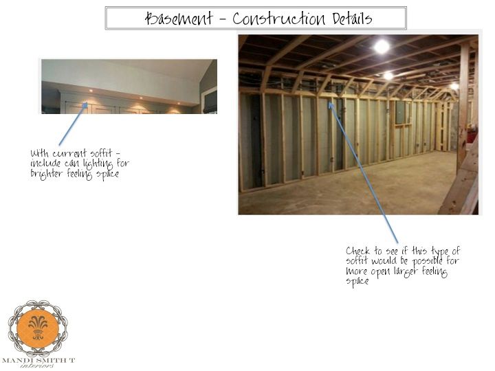
Lastly, this detail and really change the first impression you have as you enter the basement.  By opening up the stairwell on one side to the basement, you will get a much more open spacious feel.  Rather than feeling like you are entering a dungeon.  It works!  

Looking for a bit more space, it may already be waiting for you just under foot.  M.


Monday, September 8, 2014

Recent Project - Wet Bar Makeover

Here are a few before and after pictures of a rather large project for one of my clients.  Over the summer, my clients completed a total renovation to their kitchen and master bathroom.  During the process, we made smaller tweaks to this adjoining family room just so the rooms flowed and functioned in a better way.   Here is a before of a wet bar area in the family room (the kitchen/breakfast room area is to the left through the doorway). 

As you can see in the images, this was a very traditional style bar area with the walk around to serve your guests.  There was also a step down from the kitchen area into the bar area.

And here's the after:

We opted to remove the "walk around" area for more square footage in the family room.  This also allowed us to widen the door way (you can see it in the left in the below image) between the breakfast room and the family room.  

The result is a fabulous updated look.  Just one more thing to mention - we decided on a copper countertop to save a bit of money and inject some rustic charm into this otherwise traditional home.  This is a win win for the budget and the look!

As I've said in the past, small tweaks can have a huge impact on your space.  This area functions in the same way as before, but does so in such a visually different way!  Hope you have a wonderful week. M.


Tuesday, September 2, 2014

Recent Project - A Family Room Makeover

  Back in May, I helped a client with a design plan for their family room.  When we started the project, the TV was on the opposite wall from the fireplace and the furniture was facing in with the fireplace and TV as opposing focal points.   This really limited the amount of seating in the space.  

In my design plan, I placed the TV in the bookshelves to really opened up the space and allow for additional seating.  Sorry for the blurry image!  I snapped these with my phone, and I'm no photographer. 

I wish I had taken a before of the fireplace.  It was stone all the way to the ceiling, and my clients were never really happy with how it looked.    The dark grout and stones made the room feel heavy, and dark.  So, rather than tear out all the stone work, I suggested we leave it and cover the upper portion of the stone with some architectural detail.  Here's the result.   

By reducing the amount of stone work you see, it becomes a lovely focal point adding great texture and interest to the space.  Also, the painted trim work above the mantle really lightens up the space and gives the entire room a less rustic more traditional feel which is in keeping with the rest of this beautiful home.  


We also painted the backs of the bookshelves a darker tone to help "blend" the TV into the bookshelves and ground that entire wall. 


I then restyled the bookshelves for balance and interest. 

Just love this flying pig! 

Lastly, we kept this well loved leather chair in the room, and I think it looks fantastic in it's new spot.  The patina of the leather really adds lots of character to the room. 

Hope you enjoyed the tour.  I'm going to try and remember to take more pictures of my projects in the future even if it's only with an iPhone! Hope you have a great day. M.