Wednesday, September 25, 2013

Shagreen Goodness

I've had shagreen on the mind lately.  Loving the warmth it adds to a space while still giving you a moment of chic goodness. 


And for an affordable faux option of this yummy texture. It's only $52.49 at Target.

Have a great day - week's half way done!  Woot! M.


Monday, September 23, 2013

Let's talk Floors


For a room to have a high end feel, it needs to be layered.  Often times, people think you can throw in a couple of pillows and make it feel fresh.  Well, it really takes more thought to get the look.


You need to look at each element in the room and realize the sum of the layers is what creates the feel of the space.

Today, I wanted to talk about a layer that is often overlooked.  I want to talk about flooring.  This layer is so important to a great space.  Not only does it need to be durable, but you also need to think about what it adds to the overall feel of the room.  For example, can you image the room below with a stone or tile floor?  It would not feel nearly as warm and cozy.


Since your floor is the single largest surface in the space (walls tend to have doorways and windows breaking them up), it is important to get it right.  Due to the ease of installation of this product, coupled with the low maintenance, laminate flooring is a high quality, low price option.  Thus, giving you an affordable, fabulous first layer to your rooms.  For example, this is an oak laminate flooring which gives you a reclaimed, wide plank wood look. 

via


The high end option though is one of my favorite flooring types and that’s wood.  I like it because it's easier to clean than carpet, but it feels warmer and cozier than tile.  So, if you are considering new flooring for a space, I would encourage you to research wood.   


There are lots of options for wood flooring, and it can get confusing.  For starters, the most expensive option is real hardwood (which is a solid single cut of wood through and through).  Many homeowners think they have real hardwood when, in fact, most flooring used in the US is engineered hardwood floors.  Engineered wood floors can be broken into two types, both have a base of a wood/acrylic product with a layer applied to the top.  For some it is a real wood veneer that is applied to the top which can be refinished a couple of times and then has to be replaced.


For others, it's a laminate product that is made to look like wood.  I say all this not to confuse or dishearten you.  The good news is you can have the look of wood regardless of your budget.  There is a huge range of price points which give you lots of options in deciding what type of flooring you want in your spaces.


Today, I want to focus on the lower end of the budget - the engineered laminate flooring option.  As technology changes, so has the quality of the laminate floors on the market.  Details like surface finishing and grooved edging have really taken this type of flooring to a whole new place.
via


Given the durability and look of laminate, it is a great option for lake houses, pool houses and even high traffic rooms in your home where water is an issue (i.e., bathrooms, kitchens, or leaky basements.  Also, the warranties on some of these laminates are crazy good (i.e., 30 years in some cases!).  So, they are worth a look see.  Love this really dark option for a more chic feel.


If you thought the wooden flooring look was not an option for your home, think again.  Now, go do your research.  Happy Monday, everybody!  M.

Disclaimer: This post is in collaboration with Carpetright. 


Friday, September 20, 2013

A Redesign

Happy Friday! Do you ever get a song in your head that you can't seem to shake?  A couple of weeks ago we were in Knoxville for a soccer tournament for my daughter.  One of the parents would yell "pressure!" every time their daughter got the ball and inevitably my brain would start playing "Under Pressure" by Queen.  Weird, I know.  I had to come home and download it on iTunes - still a great song. 

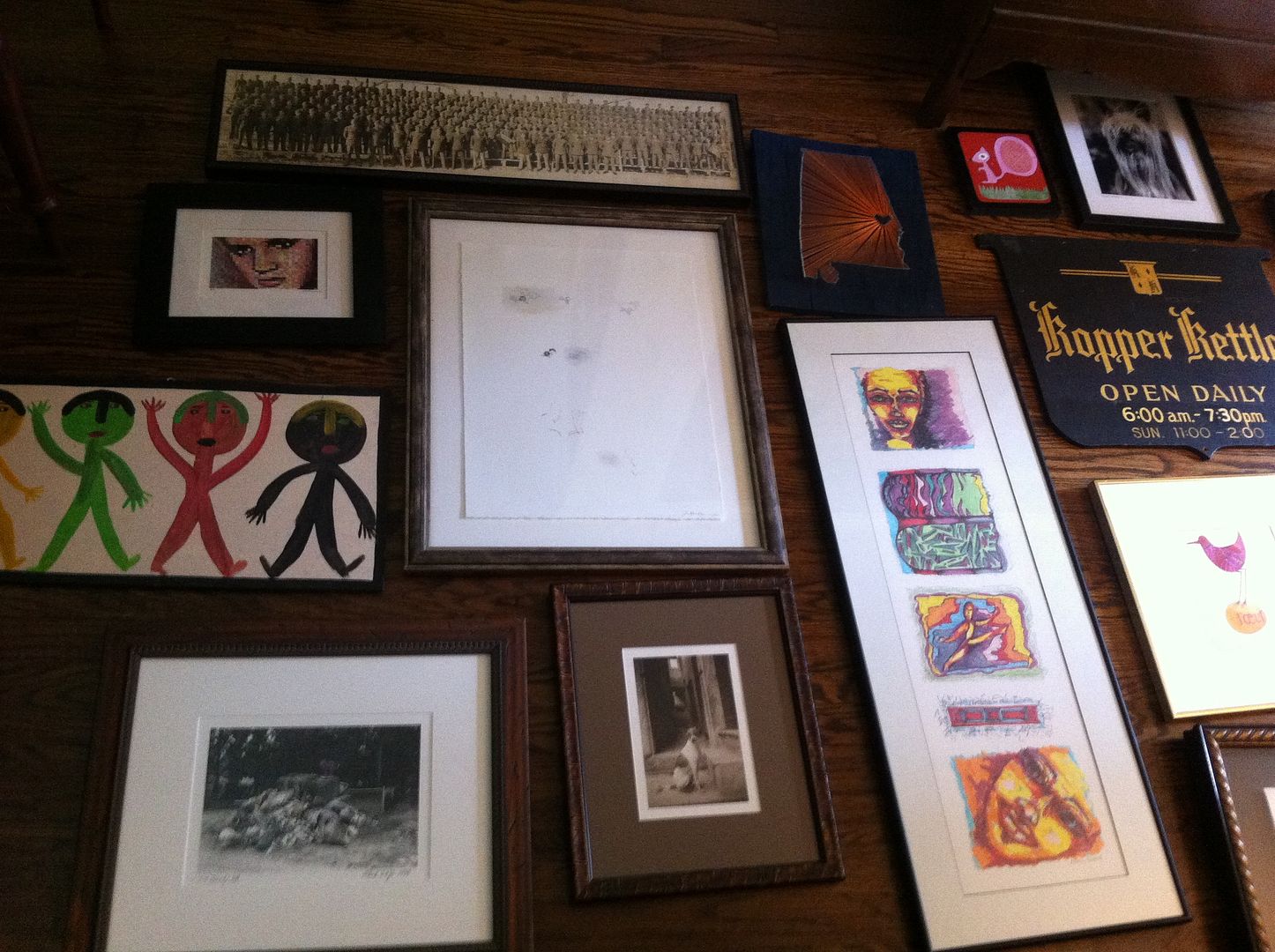
Sorry to digress - none of the above has anything to do with today's post!  Today, I wanted to show you a few pictures of a redesign I did last week.  While I love creating design plans, my favorite project is still a redesign.  This is using what a client already has in their home to create a completely new and fresh space!  I love their reaction when they see things they've purchased and love in a whole new way.  Also, the final result is always an unusual mix of found objects you just can't accomplish with all new items.  So, here's what we did.  Caveat: Some of the pictures are blurry as I took them with my phone, so please excuse the quality.  As usual, I was so excited to get started that I forgot to bring the camera.  So, when we arrived that morning, this is what we had to work with - a clean slate (it saves time if the client pulls everything down, so we can get to work).  This is the wall you see when entering the home.

It was just begging to become a gallery wall!  Also, I did not take any wide shots of the room, so I thought I would show you the layout of this cozy cottage.  Originally, the sofa was on the window wall and the gallery wall had a small chest flanked with a pair of armless chairs.  One large piece of artwork hung on the large wall.  When I saw the space for the first time and all the incredible artwork this client had collect over the years (which was all stored), I knew we needed a new layout so we could display all that incredible artwork.  Here's the before:
After several tries on the new layout (we are not dealing with a lot of space, people, so furniture placement was very challenging!), we came up with this new layout which gave us that big fabulous wall for artwork.


When creating a gallery wall, it's important to lay the artwork out on the floor to really get the best result.  This will allow you to play with the shape of the frames, the color of the artwork and how the two play off of each other in the finished gallery wall.  Also, it will allow you to see the finished size of the grouping to make sure it will fit on your wall!  Here are a couple of shots of our layout (it was so large, I had to take it in sections). 


By taking a picture of the placement when it's on the floor, it actually helps you to remember exactly where each piece is in relation to the others (this is sometimes difficult to remember once you begin to hanging the pieces on the wall).


So, here is a picture of the final wall.  You can see, we adjusted the wall a bit from the floor layout, but I just love the result - wishing I had such fabulous artwork for my own space! 


And here are a couple of other spots in the room we freshened up with artwork and styling.
As an aside, the TV will be hung over the fireplace.  I've had lots of conversations with clients lately about whether it's "proper" to put the TV over the fireplace.  While I love a room with the TV completely hidden, sometimes the best layout for the room will dictate TV placement over the fireplace.  This is a very small living room.  The only other wall (other than over the fireplace) where the TV could go would be our fabulous gallery wall. So, we opted to put it over the fireplace.  The writing desk was in a guest bedroom and the shield mirror was in a closet.  Initially we had the military picture included on the gallery wall, but decided this side of the room needed more height (you will understand when you see the wall to the right of the fireplace).  Stacking artwork is a great trick to give you some symmetry for walls on either side of a focal point like a fireplace.


Sorry this picture is so blurry (below).  This is the wall to the right of the fireplace where the armoire was initially placed.  Wish this picture were clearer as the series of artwork is from a favorite artist, Kate Merritt Davis.  I have one of her pieces in my own kitchen! 


Then we moved the large piece of artwork that was on our now gallery wall to a small wall separating the living space from the dining area.  This created an entry way feel.  We toyed with the idea of painting the side of the bookshelves the wall color just to give us a larger wall for this chest, but in the end, all the trim work/detail in this spot would have looked a bit off (hard to decide where to stop the wall color without it feeling strange).  So, instead, we placed a basket in that spot to be used to store shoes, or umbrellas, etc.  It also added lots of texture in a layered way. (see our note to the client of what she could use this for!)


One last picture, we also restyled the bookshelves for a fresh look next to the gallery wall.  


There are a few new furniture pieces coming into the space.  Once they arrive, I'll have to get additional pictures to show you.  Happy Weekend.  M.


Monday, September 16, 2013

Emerging Trend - Arrow Design

I love it when I begin to see a new trend.  This one is an "arrow" (also called "feather") design.  It's similar to a chevron pattern, but fresher.  I dare say more youthful and fun.  Have you noticed it as of late?
via

I started seeing all different versions of it popping up when sourcing fabrics back in the Spring.  Now, it's more than fabrics - I'm seeing wallpapers and even accessories like trays, jars and bathroom accessories.


I can see using this pattern just as you would a chevron either as the main accent fabric (if it has several colors in it) or as a secondary fabric (if it's a two color fabric like below). 


Just love this take on the trend - it feels tribal and modern all at the same time.

via

I will definitely be working this into a design plan soon.  Happy Monday! M.


Friday, September 13, 2013

Curb Appeal - an Update

It has been one busy week - I have been working on design plans, completed a really fun redesign with one fabulous gallery wall (I will be posting about it next week), and I've been making some changes at my own house (again, I will be posting about this too).  But, I wanted to give you an update on the curb appeal project I posted about back in May.  Here's the original post

When I last posted, we had completed the painting and clearing of the yard and were ready to install the landscape design plan for this home.  If you recall, my clients had enlisted the help of Randy McDaniel  for a plan to really play up the best features of this home.  

Well, here's the final result. . . . 

My clients are so happy with how it all turned out, and are especially thrilled to be finished and enjoying their new yard.   This is the side yard - since this home is on a corner lot, it was important for this side of the home to look great as well. 

They magnolia will add some privacy as they grow. 

I love the portion of the lawn thats dips into the bed on the left side of the house - really gives it a welcoming feel and breaks up the sidewalk.

This is one of my favorite things in the design plan - a pair of Espalier trees!  The perfect way to turn a large wall into a lovely focal point. 

Notice the extra large planters in the front - interesting shape and very lush with the addition of the boxwoods.

Happy weekend, everybody! M.


Wednesday, September 11, 2013

Alessandra Branca for Schumacher

Back in January, I was interviewed by Birmingham Home and Garden as a Tastemaker for trends in 2013.  One of the trends I mentioned was the 1980's floral resurgence.  I also posted about it almost a year ago when I first began to notice the florals popping up - Trend Spotting 80's Floral

Fast forward nine months and this trend is in full swing - case in point, Alessandra Branca collection for Schumacher.  The colors are extraordinary in this collection.  The number of colors in the signature fabric is over the top.  Also, it very hard to tell from the images I snapped while at the design center, but the floral fabric below is a chintz!  Then the IKAT chevron is a polished cotton.  

While it does take some getting used to - deep breaths really.  When I look at the floral pattern on it own, I have flash backs of college and all the dorm rooms my freshmen year.

But, when it's paired with current wovens and fretwork patterns, it feels fresh to me.  Much more hip and chic than my college days.  

Also, in the more muted colorways like this citrine with blacks and deep greys, it feels much more current to me.  All these are part of the same collection.  I love that she's included lots of secondary patterns to soften the busy floral. 

So, what do you think?  Are you ready for a blast from the past?! M.


Monday, September 9, 2013

Hand Painted Velvet - Follow up

Do you remember this tease of a post I blogged about back in May?  See the entire post here.  If you recall, I showed you this picture in my post. . . .
 

I know, it was mean of me not to give you the details, but we had just started this project; and I really wanted to save the reveal once the installation was complete.  I had visited the studio of the very talented Kitty White, and had fallen in love with these hand painted strips of fabric.  We began to collaborate on this project, and came up with a wonderful hand dyed velvet trim to pick up the tone of the teal colored mohair host and hostess chairs.  Kitty then painted a metallic paint onto the fabric and re-dyed the velvet for a wore look.  The process was quite meticulous but the results were well worth it.

Here's the result . . . 

Kitty White is truly one of the most creative people I've ever met.  Not only is she a fabulous decorator and artist, she also designs some of the most stunning jewelry I've ever seen.  Her studio is in a carriage house behind her home and the entire space is totally enchanting.  If you are interested in something similar for your home, please contact her.  Just a visit to her studio will inspire you beyond words!    

When we started this project, the room was actually a formal living room.  My clients never really used the living room and were in need of some office/homework space on the main floor.  

Also, they did not want to permanently alter the floor plan of the house.  So, we decided to visually close the large opening between the formal dining room and living room by using the linen drapery panel.  Here's a close up of the tape.  Since our plan was to layer the artwork on top, I chose an inverted flat pleat on the tops of the drapery panels.  

Once the dining room was in it's new spot, we created the office space in the room beyond (which can now be accessed through the kitchen area).  As an aside, the doorway was not center on this wall, so we used the drapery panel to center the buffet on the accent wall.  

The result - a marvelous focal wall in the dining room.   As you can see, the oil painting over the buffet appears to be floating on top of the drapery panel.  I will be posting later on how we accomplished this. Since we had two story ceilings in this room, we had to be very clever on how we hung the painting. 

I promise to share the trick with you very soon!  Until then, I hope you have a marvelous start to your week! M.


Friday, September 6, 2013

Happy Friday!

It's Friday!  We are back in full swing this weekend with activities for the kiddos.  Hoping to relax at least a bit and maybe squeeze in a little DIY project with this!  I found it in a great little shop in my home town and just had to snag it.  Remember my post here about this new product? 

I decided on the white perfection, since it will allow me to move it from room to room with the greatest of ease.  Now, I've just got to figure out what I want to use it on - maybe a tray?  Maybe some picture frames?  Not quite sure, but I'll let you know what I think when I'm done.  


I'm also hoping to delve into the new online issue of Lonny.  

If you have some time this weekend, you need to find a comfy spot, grab your reader, and check it out!  I always find inspiration lurking behind the cover of this magazine.  

Have a wonderful weekend! M.

read the info for a dependable seller that will give you the metal bookcase industrial you're looking for quickly and easily.