Sunday, December 7, 2014

The 2015 Color of the Year is Revealed!

So, have you heard?  Pantone announced the 2015 color of the year, and it's Marsala.  I was really surprised.  It feels a lot like a color we all know and love (just kidding on the love part) from our past called Burgundy.  Yelp - there I said it.  Since, I don't love the idea of burgundy, I'm choosing to interpret this color more like a coppery wine, rather than a fortified wine!   

My advice to you on this color - make sure you are seeing some brown in it and think small doses!  Also, if you watch this video of the explanation of this color you will note their discussion of brown (not grey) starting to make a come back in interiors - "Why Marsala?"  So, for those clients out there who begged for grey walls, aren't you glad I steered you to the warm grey tones rather than the cool grey tones?!  The warm greys (aka greige) will still work wonderfully with Marsala as well as the brown tones beginning to make a comeback.

On a side note, I read the most interesting article in Vogue Magazine this month about people who have additional cones their eyes.  It's a genetic mutation which allows them to see colors a normal person is incapable of seeing in the environment.  Very cool I must say.  I do think color is such a personal thing and people see it so differently.  So, it's interesting to take a color like Marsala and play with the spectrum of it a bit.  Here are a few examples of what I'm talking about with Marsala.

I think what makes this work for me and not read burgundy is the stria in the color (I think this is actually a stain on wood).  The lighter tones are helping this to feel more brown to my eyes.

Not seeing burgundy at all with this grasscloth treatment - it feels more orangey.  I love it.  Very fun interpretation of Marsala.

The idea of coppery anything - sign me up!


This one is getting closer to Burgundy for me, but it's such a small dose and when used with  the light and airy wallpaper, it is lovely.  As a side note, this is a fabulous use of mirrors in a space - you've double the windows here.  

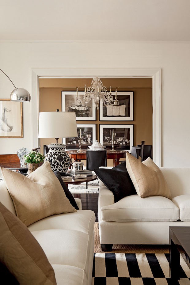
When the color has more brown in it (like this coverlet) you can venture off into the gold hues for a much warmer feel. 

Look how fabulous it looks paired with green tones - again when you accent the brown tones in this color.

Even with a true green . . . 


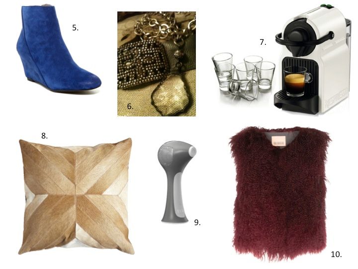
And let's not forget, we can always wear this color for a current look.  

Last side note: For a really great list of color matches to Marsala for all the popular paint brands, someone at Lonny Magazine has already done the work for you.  That is, if you're brave enough to paint something this color!  M.


Monday, November 17, 2014

Neighborhood Gifts Ideas

If you've read my blog for any length of time, you know I love a good neighbor gift!  I look forward each year to coming up with something fun and unique to give our neighbors and close friends.  Since the current year's gift is always a surprise, I share the past year's gift here in hopes you will be inspired to come up with a special gift of your own for your close friends. 

This past year, I decided to make Honey Orange Syrup as our gift. 

I found this fantastic recipe which could be made ahead (always a priority for me since I like to make these up over a weekend and deliver them throughout the following week as time permits).  After I nailed down my recipe, I got busy coming up with a custom label.  I created the labels on my computer and then took them to a print shop to have them printed on card stock paper. 

When you create an unusual recipe as a gift, it's important to give you recipient some ideas on how they can use your gift.  Also, I love recipes that can be used in multiple ways.  It makes the gift more meaningful.  

Once you've decided on the perfect recipe and gift tag, you need to think about how to present the gift in a fun way.  I loved these bottles I found with the cork tops and ordered them early to ensure I would have enough for all the gifts.  

I then ordered the fun twine and used it for a simple way to attach the gift tags.

Now, if only I had my gift for this year worked out.  It's time to start brainstorming! M.

 PS:  If you're curious about the gifts I've given over the past few years, click on this link to see the details Neighborhood Gift Ideas

Monday, November 10, 2014

Gifts for Girls


Now it's the girl's turn for some gift ideas.  Full disclosure here, many of these items are on my personal Christmas "wish list." That must be why the girl's list is so much easier for me to pull together!   


1//2//3//4//5//6//7//8//9//10//11//12//13//14//15//16//17
(click on the corresponding number for the source)


Friday, November 7, 2014

Ways to Get the Look

Here are two similar looks, but the pricing on these are very different.  Can you tell which is the more expensive (as in $1,000.00 more)?

via


In the first image, they have used a basic subway tile and simply laid it out in the a herringbone pattern to get the look.  In the second image, those tiles have each been hand cut on a perfect angle to match up with the adjoining tile to create a chevron pattern.  So, image number two is the more expensive due to the additional labor required of the tile work.  

I think as the chevron pattern becomes more popular, we will begin to see ready made parallelogram shaped tiles (my son would be so proud I worked in "parallelogram") in the real stone/marble tiles. 

Here are just a few more to consider in some lovely rooms. 


Have a wonderful day! M.


Monday, November 3, 2014

Gifts for Guys

It's that time of year again!  The Christmas music has already started on a couple of radio stations here in Birmingham.  I know, I know.   Hard to believe.  I love it, but it also makes me anxious.
There really are only a few short weeks to go.  Is it just me or do you also find it harder to come up with fabulous gifts for men?  Well not this year!  I decided to start with the most challenging gift list to kick off the season.


1//2//3//4//5//6//7//8//9//10//11//12//13//14//15//16
(click on the corresponding number for the source)

I'll be following up with other gift lists in the next few weeks.  If you will make a few purchases along the way this season, you will not feel as stressed out; and the holidays will be much more enjoyable! M.


Wednesday, October 29, 2014

Antique Lesson - French Biot Jar


These lovely jars were produced in the first half of the 18th Century in the Biot region of southern France.

Their purpose is quite obvious - they were used to store both dry and wet goods.  

At the time these were very utilitarian.  But, now they are truly like antique works of art and can add some real interest to a space.   

As you might expect, lots of other cultures created similar vessels for everyday use.  So, whether you are considering the French version or one from Italy or even Greece, they are a lovely addition to any interior!


Tuesday, October 7, 2014

Getting the Trend - Black and White

How many times have you notice a fabulous new trend and thought, "love it, but it won't work in my house?"  While trends can be enticing, they can be difficult (aka expensive) to incorporate.  Today, I wanted to give you my thoughts on a current trend and how to make it work in your space.  The trend is "Black and White," and it's totally hot at the moment.  Here are a few images to give you the idea . . . 


This biggest problem with this trend is most of us do not have white sofas or chairs to use with the black and white pillows.  Don't get me wrong, I've sourced a few white sofas in my career.  But, even with those, they are always slipcovers that can be washed.  For most people, the larger upholstered pieces in your home are beige in tone (this makes it much easier to switch up the look with pops of color).  So what happens when you want to incorporate black and white pillows?  They just don't seem to work with beige to give you a chic vibe.

There is a simple solution - make sure your black and white pillow scheme includes some beige.  Yep.  That's it. Easy Peasey.  Here are a few boards I pulled together for a client project pulling in some of the beige tones. 


Now for a few images  of spaces using this trick!  Incorporating some beige tones in with the black and white makes it work . . . 


If you need help pulling your spaces together or just want a fresh perspective, call me.  I can help!  For more information on my design services, click here. M.


Tuesday, September 23, 2014

Creating More Space

Are you craving more living space and not sure how to get it?  Well, the basement is a great place to start.  If you've not thought about reclaiming that space, now's the time to consider it.  It's one of the cheapest ways to gain square footage since this space already exists in most homes.  You just have to make it livable.  

Here are some layouts I completed for a growing family who wanted more living spaces for their family.  When I develop furniture layout plans, I like to give my clients a couple of options on layouts so they can really think about how they want to live in the space.  

In the first layout, I included a pool table.  You need a proximately four feet of wall clearance for a comfortable game of pool (reminds me of an episode of Seinfeld when they put the pool table in a tiny bedroom).  So, in order to get this spacing, the client will need a seven foot pool table (as opposed to the standard eight foot table).  


I also did a secondary layout that would maximize seating in the area - this is super important if the main function of this room is for watching football with friends!

Then, using the same basic furniture pieces, I created a different layout.  This is helpful for the client to see that they can make the space feel fresh an new by simply changing the layout of the pieces they already have for a new look. 

In addition to planning the perfect layout, there are a few other elements that can really change the way a basement area feels.  The single most important element would be lighting.  It's super important to make sure you have plenty of overhead lighting as well as layers of additional lighting in the form of floor lamps, table lamps, wall washers and /or sconces.  This will allow the space to feel light and airy as opposed to dark and cave like.  Here are a couple of other construction details that can really transform the feel of a basement area. 

If you have a soffit area than simply has to stay, consider creating an angled soffit (rather than a traditional boxed soffit).  It makes a huge difference visually to the space (especially if the ceilings are lower).

Lastly, this detail and really change the first impression you have as you enter the basement.  By opening up the stairwell on one side to the basement, you will get a much more open spacious feel.  Rather than feeling like you are entering a dungeon.  It works!  

Looking for a bit more space, it may already be waiting for you just under foot.  M.


Monday, September 8, 2014

Recent Project - Wet Bar Makeover

Here are a few before and after pictures of a rather large project for one of my clients.  Over the summer, my clients completed a total renovation to their kitchen and master bathroom.  During the process, we made smaller tweaks to this adjoining family room just so the rooms flowed and functioned in a better way.   Here is a before of a wet bar area in the family room (the kitchen/breakfast room area is to the left through the doorway). 

As you can see in the images, this was a very traditional style bar area with the walk around to serve your guests.  There was also a step down from the kitchen area into the bar area.

And here's the after:

We opted to remove the "walk around" area for more square footage in the family room.  This also allowed us to widen the door way (you can see it in the left in the below image) between the breakfast room and the family room.  

The result is a fabulous updated look.  Just one more thing to mention - we decided on a copper countertop to save a bit of money and inject some rustic charm into this otherwise traditional home.  This is a win win for the budget and the look!

As I've said in the past, small tweaks can have a huge impact on your space.  This area functions in the same way as before, but does so in such a visually different way!  Hope you have a wonderful week. M.