I have often said that paint can fix a world of interior design mistakes. You can use it to highlight really great architectural features; or in the case of my kitchen, you can hide a whole lot of ugliness.
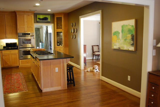
For those who have not had the pleasure. Here is a Before of my kitchen . . .
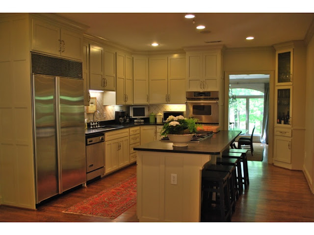
And now for the After . . .
And again. Before.
And After. It doesn't look like the same kitchen (at least it doesn't to me).
The color is Ben Moore Grant Beige; and honestly, I think it changes with the light of every hour in the day. It is looking very warm and green in this shot, but at certain times, it feels grey.
In addition to the kitchen, we painted my breakfast room the same color. You can see how different the color looks in there.
Here's another Before picture taken from the same direction. The dark chocolate color in this before image is called Seal Skin by Martin Senour; and truly, I loved it. I can't say the same for the maple cabinetry. Just was not my taste.
Now, before you start commenting on how you can't believe I painted maple cabinetry, they were not solid. Instead they were a thin veneer that was just begging to be painted!!!
The kitchen is in the center of my home, so I have no windows in the space. This made the chocolate color feel even darker. I think the lighter color really helped to make the space feel larger and more airy.
In addition to the walls and cabinetry, I also painted all the trim the same color. This is a great trick to make a room feel larger and more cohesive. When a room has a lot going on (i.e., cabinetry, door casings, windows, etc.) it can feel very chopped up. By painting it all the same color, it becomes cleaner and larger.
I still have a few extra things to do in the space, but I wanted to show you the progress. I plan to include some simple sheer linen cafe curtains on the bay windows, just to soften the look (it is very private in the back, so I'm going with a sheer fabric) hang some new artwork (maybe those sea fans I found), and some lighting over my island. I will share all those ideas with you in a later post (would love your thoughts).
But for now, I am loving the change.
Oh, one last thing. I changed the hardware on all the cabinets. What I love about these pulls is the size. I really think the larger hardware feels more current. These are 7" pulls. I put my hand on them to give you an idea of the actual size.
In this picture you can really see how the pulls stand out in the space.
Overall, I am thrilled with the result.
The power of paint never ceases to amaze me. Even in my own kitchen.
Happy Monday. M.


No comments:
Post a Comment